Categories
General

Brand history: the incredible story of British luxury luggage marque Globe-Trotter

20121121-084741.jpg
A unique combination of tradition, secret materials, and innovation

Globe-Trotter is a luxury brand that was founded by Englishman David Nelken in Saxony, Germany, in 1897. In 1901, the company returned to the UK, and it has been there ever since. The values that have always defined the style of this brand are not difficult to identify: heritage and craftsmanship. Typically British characteristics, you could say. However, what is truly unique about this House is its inimitable way of combining traditional techniques with a focus on new design, whether this regards colour, materials or design.

20121121-084839.jpg
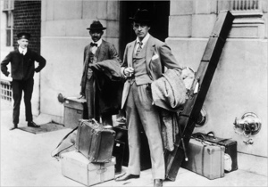
The wonderful period photographs that the company possesses provide a superb portrait of the brand, in the hands of figures such as Winston Churchill who used the 18-inch attaché case while he was Chancellor of the Exchequer, Queen Elizabeth II, who used Globe-Trotter cases for her honeymoon, Sir Edmund Hilary, who found the suitcases ideal to take his kit up to first base cap during his assault on Everest in 1951, and more recently, Daniel Craig, Kate Moss, Sofia Coppola and Kylie Minogue, to name just a few. Its powerful image has led it to being chosen by other luxury brands who use Globe-Trotter products in their visual communications. Examples include 10 Corso Como, Vogue, Wallpaper, Hermès, Liberty of London, Ross Lovegrove and Junya Watanabe.

20121121-084928.jpg
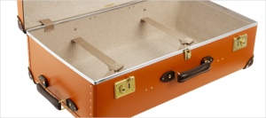
The Globe-Trotter factory in Hertfordshire makes the cases by hand on Victorian machinery, in a unique material, “Vulcan Fibre” or vulcanised fibreboard. This was invented in the UK in the 1850s, and it is basically 14 layers of paper that are bonded together and coloured – though the exact process is a patented and closely-guarded secret. It has never been successfully imitated. Vulcan fibre is a very tough but light material, as lightweight as aluminium, but as hardwearing as finest leather. In fact, Globe-Trotter cases are extremely tough, and the company has an archive of suitcases that are up to 100 years old. The frame is in ash wood, while the lining is in fabric, and the trim is of course in leather. Cases are riveted, lined and trimmed by hand. Many of the craftsmen at the company have been working for Globe-Trotter for decades, and this highlights the great satisfaction that is derived from creating high-quality products.

The toughness of Vulcan fibre has featured strongly in the company’s communications over the decades. The image of an elephant standing on a case is not just advertising. A test was actually performed at the Zoological Gardens in Hamburg, with a 1 tonne elephant that stood on a Globe-Trotter case with its full weight. The case withstood the pressure. Still today, the factory sometimes receives 100-year old cases that are sent in to have their linings changed. Globe-Trotter luggage sets fulfil the need for lightweight suitcases in modern travel.

Globe-Trotter applies an original approach to colour. In the early days of travel, luggage was all brown and black. Even then, Globe-Trotter decided to make a splash with some new colours. Blue was one of the first additions to the range, expressing sea and air travel. More recently, the brand has introduced other colours, and original print designs. Today, the classic colours of navy, black, green, ivory and colonial brown, of timeless appeal, have been joined by more modern shades such as Jewel pink, Cruise blue, Centenary red and Orange/Tan. Globe-Trotter has not subscribed to the complex interior pockets that are a feature of many luggage brands, preferring absolute simplicity. This ensures that travellers have the maximum space possible.

Today, the company’s products include the ‘Original’ series, with the signature leather straps and a limited range of classic colours. This range has remained the same since 1897, from when the company was established. The ‘Centenary special edition’ was launched in 1997 to celebrate the 100th anniversary, and it features classic and pop colours, with high quality leather corners and straps. The ‘Safari’ series is based on cases made by Globe-Trotter in the late 1920s, and they comprise ivory-colour cases, resembling those used by explorers who travelled the world by cruise liner. The ‘Cruise’ series is striking in its royal blue colour, with navy blue straps and corner details. Inside, the lining of white cotton with pinstripe blue stripes is a superb expression of summer seaside living. The ‘Orient’ collection features a hand-lacquered gloss finish, created using valuable Urushi lacquer, with fine designer oriental silk linings.
‘Onehundred&ten’ was designed by Ross Lovegrove, and it is hand-made in Japan from 3X fibre, comprising woven carbon fibre and tri-axial woven Kevlar. These two materials are layered and bonded to create the first-ever next-generation Globe-Trotter hard case, weighing just 1.4 kg.

The Burlington Arcade flagship store (54-55 Burlington Arcade, Mayfair, London W1J 0LB, tel. +44 20 7529 5950) is an appropriately refined experience, with interiors influenced by 19th century British architect Sir John Soane. On the second floor, customers discover a totally different atmosphere with respect to the ground and first floor, and can relax amidst plush furniture and a range of images and artefacts from Globe-Trotter’s long and glittering history. Here, bespoke cases can be ordered, unique for colour, linings, leather corners, and personalized initials. Another bespoke feature available at the Burlington Arcade store are cases without wheels – in fact today’s Globe-Trotter cases are made with wheels as standard.

In London, products are also available at Harrods, Selfridges, Browns and The Conran Shop. Products are distributed worldwide by means of selected retailers, which can be seen at the store locator on the company website.

For further information on Globe-Trotter and its products, see www.globe-trotterltd.com

Published in April 2010, luxos.com

Categories
General

Astrofashion – every day has its colour

What am I going to wear today? It depends on a lot of things, the stuff that I have in the wardrobe, the stuff that I’ve managed to iron, or the clothes that best suit the occasion, perhaps with influences from things like fashion, family, friends. For other people, style consultants, personal shoppers and so forth may also be involved.

But with the term Astrofashion, I would like to suggest a different system. The colour of the day. Every day has its colour. The colour provides a defining ingredient for the day’s outfit.

Seven days, seven colours

There are seven days in the week. The names of the days suggest a link to the seven planets of ancient science. Isaac Newton theorized the existence of seven colours – red, orange, yellow, green, blue, indigo, violet – but apparently he put in indigo specially to make seven colours (he liked the number seven), and so I would simplify this and say that we have red, orange, yellow, green, blue, violet, and black/white/grey.

Monday – black/white/grey

Let’s start with Monday. Linked to the moon, the metal silver, and so to the whole range of tones running from white to black. We could even choose some states of mind associated with the moon: dreams, intuition, family, emotions. And if we’re fashionistas, Armani and his insistence on black and white fits perfectly.

Tuesday – red

Then we have Tuesday. One of the things that surprises me about the days of the week is that the links with the planets exist in different languages. Just as Monday in Italian is lunedì (from luna, moon), Tuesday in Italian (to take an example of a Romance language) is martedì, connected to Mars, the red planet, and god of war. The English Tuesday is derived from Tiw’s Day, a reference to the Germanic god Tiwas and the Scandinavian divinity Tyr – gods of war. So there can be no doubt about the colour of Tuesday: red. The metal is iron.

Wednesday – orange

The name Wednesday was Wednesdei in Middle English, and wōdnesdæg in Old English (before the 13th century), and this was derived from a local version of the Latin term ‘dies Mercurii,’ day of Mercury, because the Germanic god Woden (Wodanaz or Odin) corresponded to Mercury, the god of that day for the Ancient Romans. In Italian, the day is mercoledì. The characteristics: communications, learning, divining. The colour: I would say orange, the colour of some mercury salts (in Italy they use something called mercurio cromo as a disinfectant for minor wounds; it leaves a lovely bright orange colour on the skin). I was reassured to find that the defining colour of luxury brand Hermès is orange. Hermes is the Ancient Greek equivalent of Mercury. However apparently Hermès adopted this colour by chance: during the Second World War, shortages of paper and card forced them to use the only materials available, orange card and brown ribbons. This became their signature colour combination.

Thursday – blue

Thursday comes from Thor’s day, a Norse god whose name was originally Punor, and who wielded thunderbolts. The correspondence is with the Roman god Jupiter or Jove, who lives on in the Italian giovedì. The colour is blue, the metal tin – which has a bluish silvery tinge – and the characteristics are dedication, loyalty and luck.

Friday – green

Friday is linked to Venus, through the Norse goddess Fríge, who corresponds to the Latin Venus (in Italian, venerdì). Venus was the Roman goddess of beauty and love, just like Fríge. The metal is copper, and the colour can be seen on any copper object that has oxidised over time: green.

Saturday – violet

Saturday is directly linked to Saturn, whose metal is lead. Characteristics are change, death, motivation, understanding. The colour is violet.

Sunday – yellow

No prizes for guessing Sunday, and the colour yellow. In the Romance languages (domenica in Italian) the name is based on the words for ‘the Lord’s day.’ The metal is gold, and the characteristics are authority, power, friendship, healing and wisdom.

Alchemical symbolisn

And why seven days of the week? Apparently this is not based on anything astronomical, unlike a day or a year which are governed by the rotation of the earth. It runs back to ancient traditions in Jewish and Babylonian civilizations, and it was also a feature of ancient China. The number seven seems to have a sort of deeper meaning, because it appears in all sorts of expressions such as the seven ages of man, the seven wonders of the world, seventh heaven, the seven pillars of wisdom and so forth. There are seven notes in the musical scale, seven chakras, seven arms on the Menorah. Perhaps the progression through the week, running progressively from one metal to another, symbolizes the alchemical opus, the idea of creating gold from a base metal by means of a series of transformations. This itself was a symbolic representation of our own course through life with a constant aspiration for wisdom and improvement. It also suggests the cyclic nature of life, from birth to death, creation and destruction, from season to season.

Porta Magica, Rome, photo
Porta Magica, Rome, photo by Sailko – CC BY 2.5

The alchemical process is illustrated, in the usual virtually incomprehensible fashion, at the Porta Alchemica in Rome. This “Magic Door” can be seen in the gardens on Piazza Vittorio Emanuele II. According to legend, a pilgrim – later identified as the alchemist Giuseppe Francesco Borri – staying at Villa Palombara, built in about 1680 by Marquis Massimiliano Palombara, passed through the door and disappeared, leaving behind a few flakes of gold resulting from the successful alchemical transformation of lead into gold, and a document presenting a serious of symbols and inscriptions describing the process. The marquis had the symbols engraved onto the five gates and walls of the villa, in the hope that some day someone would be able to decipher them. The Porta Alchemica is the only surviving part of this material. At the centre of the jamb, an “oculus” symbolizes the sun and gold. On the two jambs, there are six symbols, with on the left, from top, Venus/copper, the Moon/silver, Mercury, and on the right, from the top, Mars/iron, Jupiter/tin, Saturn/lead.

Porta Magica Rome
Porta Magica, Rome, engraving by Henry Carrington Bolton, public domain

To sum up, astrofashion is a way of feeling connected to all this, to the grandiose sweep of life and nature, to an archaic dimension that seems to have been swept away by our hyper-technological world but that is still there and that, in the end, will remain.

And it has one practical benefit. I am absent-minded, and so after having made a conscious decision as to which shirt to put on, for the rest of the day, all I have to do is take a glance at it to remember which day of the week it is!